by David Benoit
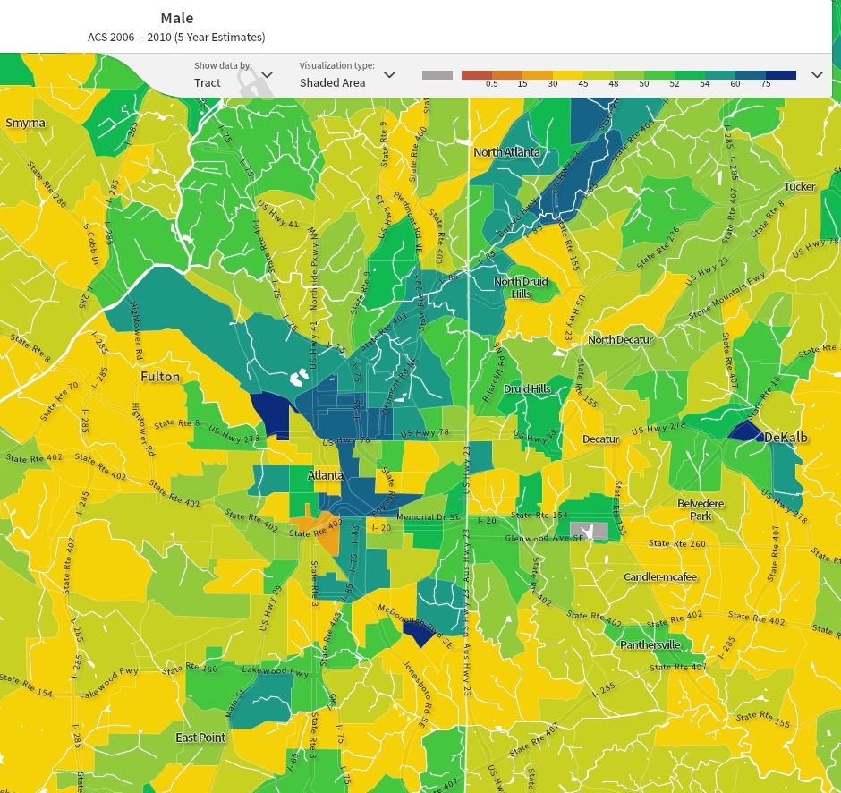
I did it. I researched the data and mapped the ratio of male to female in the City of Atlanta for you—all for you. Now you know which area of the City to move to should you be interested in finding that special someone. Or at least it’ll help you have a better shot at, you know…
The data has been broken up into census tracts. That was the smallest area I could map. I can say that the women to men breakdown in the city overall is roughly 50/50. It’s not weighted in either direction, but the placement of men to women is. What I found is that there are more men in the city proper, within the BeltLine, compared to the suburbs, outside the BeltLine and the Perimeter, whereas the suburbs are brimming with women. Inside the city limits, the greatest concentration of women seems to be in the Old Fourth Ward and Poncey-Highland neighborhood, the greatest concentration of men is the Westside, with a second tier concentration in Midtown and Downtown. Granted, this quick little study won’t tell you if those prospective mates are single or other specifics, but knowing what you know now, the odds are more in your favor if you care to roll the dice.


Here is a list of the American cities with the highest ratio of women to men.

Leave a comment